Accessible design in New UI
I just switched to the new UI and found a number of issues related to accessibility with dark background on.
As a start, I am not visually impaired, however, the bright lime green default color washes out all white text. Therefore, any item highlighted becomes effectively invisible.
Here is a quick analysis by ChatGPT.
Uploaded Image for Color Analysis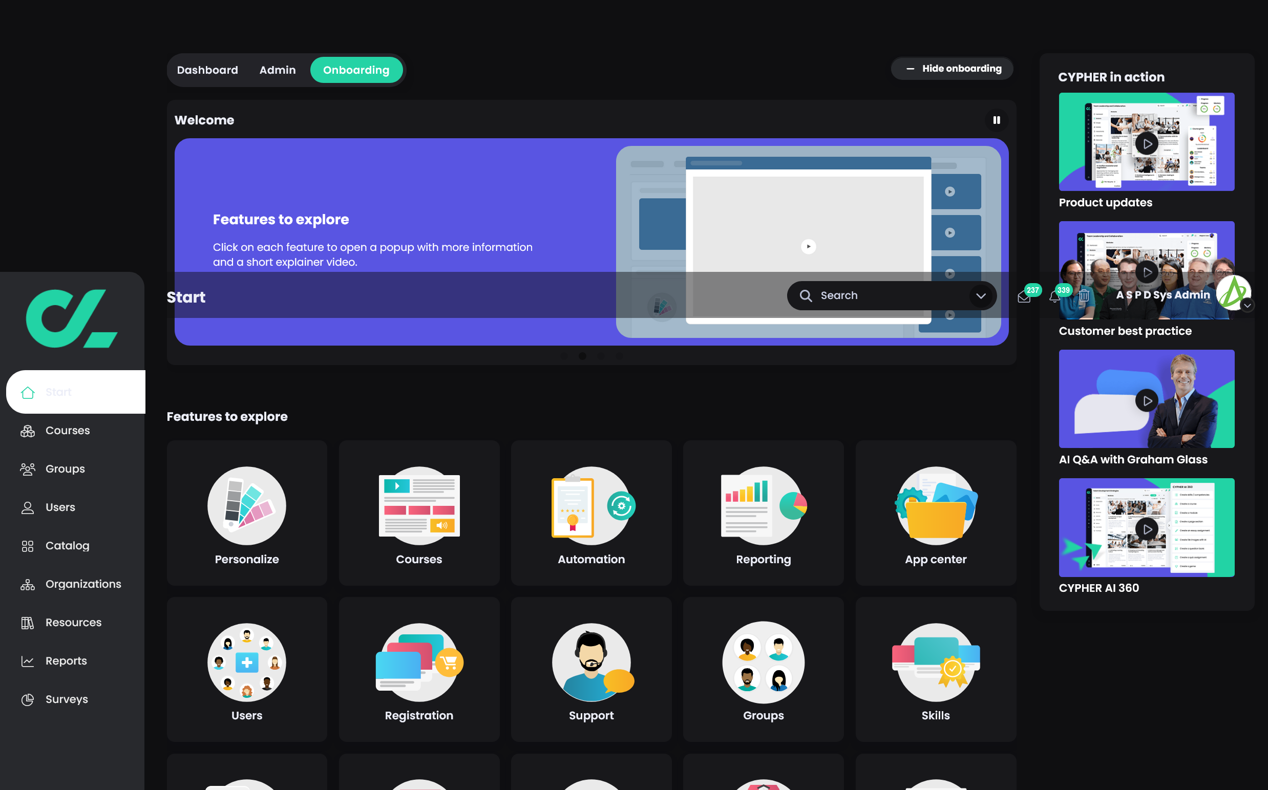
Uploaded Image for Color Analysis
Initial Findings:
- Color Use: The interface heavily uses dark backgrounds with bright highlights, such as cyan, green, and purple.
- Text Contrast: White text on black and bright-colored backgrounds is prevalent.
IDEA & Accessibility Feedback:
Color Contrast:
- Strength: The white text on a dark background generally provides good contrast and readability.
- Concerns:
- White text over the purple background in the main "Welcome" section might not meet WCAG contrast ratio standards (4.5:1 for small text). A further analysis is required to verify.
- Sidebar icons and text use light green and white, which could be difficult for users with visual impairments (e.g., low vision or color blindness).
Icons and Visuals:
- Icons are distinguishable due to their size and sharpness.
- Consider adding text alternatives or tooltips for users relying on screen readers.
General Accessibility:
- Ensure that the cyan highlights (like the Onboarding button) are not the only indicator of selection—use a border or underline for better clarity.
- Test interactivity with assistive technologies to confirm that focus states are clear.
Recommendations:
Improve Color Contrast:
- Adjust the purple shade in the "Features to explore" section to achieve a higher contrast ratio.
- Check the sidebar's green elements to ensure they meet contrast accessibility requirements.
Visual Indicators:
- Use visual markers (e.g., bold, underline) in addition to color for active or selected items.
Further Testing:
- Conduct a full WCAG 2.1 Level AA contrast check to identify other potential contrast issues.
- Conduct a full WCAG 2.1 Level AA contrast check to identify other potential contrast issues.
Topic Participants
A S P D Sys Admin