New UI is a step backward
Our staff has been reviewing the new UI.
I think there will be more comments to follow, this is just the first look.
Here are some comments so far:
- Search features are limited.
- Fonts are too small to read for admin.
- Video uploading has no direction for when a video has been uploaded. No time, no %, just nothing.
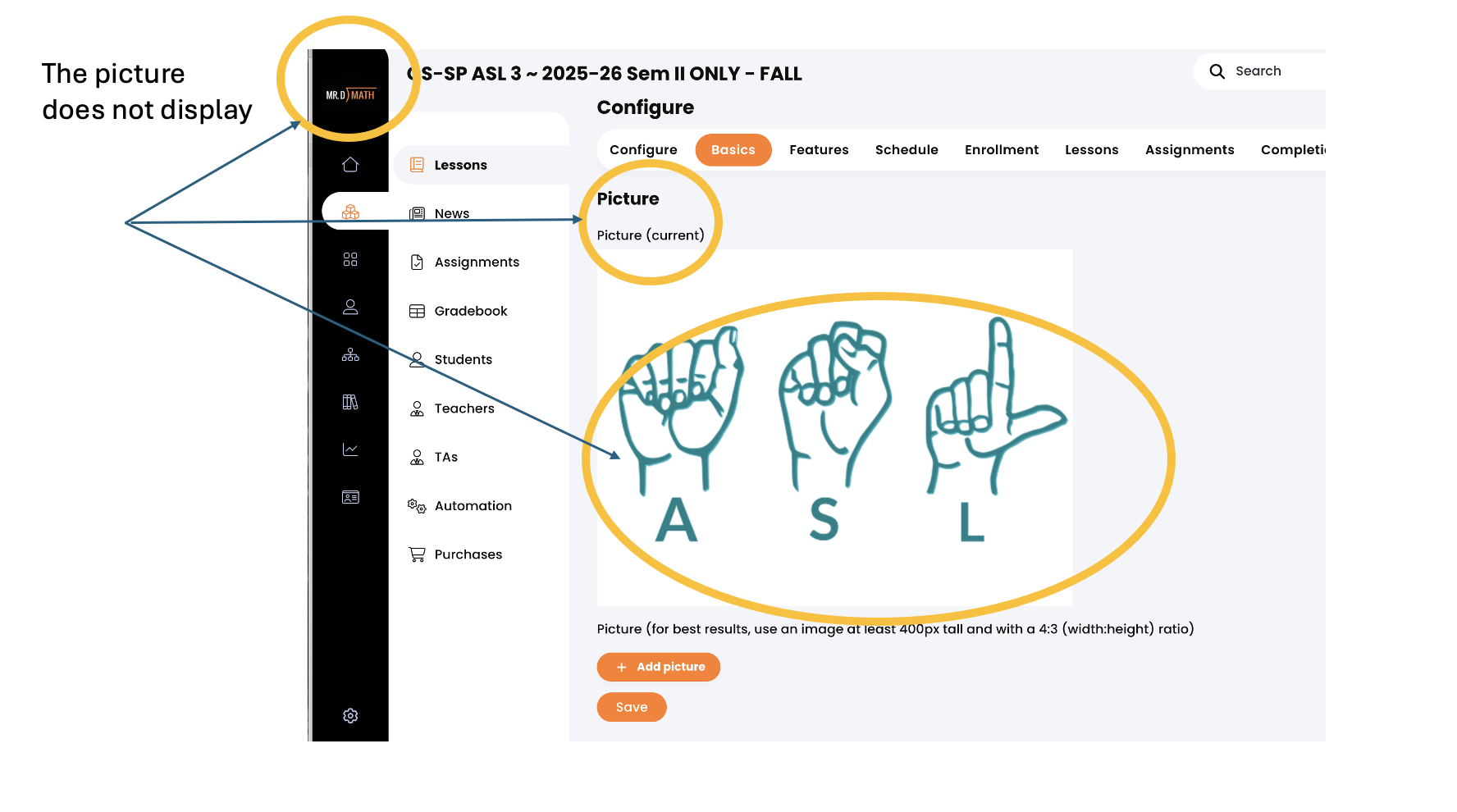
- Custom course images have been removed
- The ability to change colors in the text of the catalog description is no longer available
Here is an example
Even though the image is there, it does not display any more.
Topic Participants
Dennis DiNoia