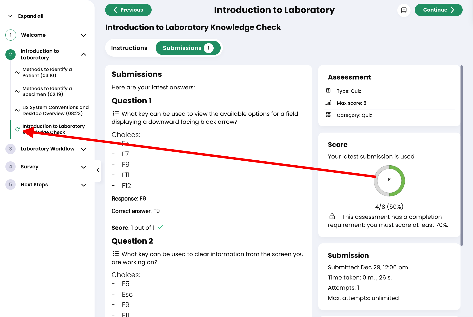
Make Quiz Retake Icon/Option More Obvious
When a User does not pass a quiz, but is given the option to retake the quiz to get a better grade, the retake option is not obvious. User very often do not see or understand the retake icon in the table of contents. The most obvious path is to click on "Continue," just like every other section.
Please consider ways to make it more obvious that the user has the option to retake the quiz. Perhaps the "Retake quiz" button could appear on the submission result page and/or the retake option in the table of contents could be red or something more obvious, indicting you did not pass the quiz, but have the option to retake before completing the course.

Please consider ways to make it more obvious that the user has the option to retake the quiz. Perhaps the "Retake quiz" button could appear on the submission result page and/or the retake option in the table of contents could be red or something more obvious, indicting you did not pass the quiz, but have the option to retake before completing the course.
Topic Participants
MedPower Support
Mark S.