Can "Progress" metric be made available in charts?
I am trying to build some reports to include in sub-org dashboard widgets, and one of the metrics we'd like sub-org admins to be able to see is what % of a particular course their learners have completed. I've tried building or adapting reports on both users and courses but every time I try to build a chart with the "progress" grouping, the report returns a blank screen.
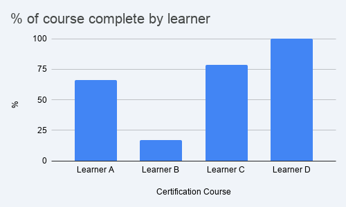
What I am trying to build is a simple bar chart that I can filter by course name and select organizations that will show me:
- X axis: Learner Name (or Learner ID)
- Y axis: % complete for selected course(s)
Something like this:
I am able to get a CSV that gives me the precise info I need (learner name/ID, course title, % complete) but have been stumped in my efforts to get that represented graphically. It would be great if learners Progress / % complete by course could be pulled into a chart.
Topic Participants
Ben